Aspect ratio
A box that keeps its width to height, for an image, a video or a map. A new ratio glides into place, and a class can change it at a breakpoint.
npx shadcn add https://kinoui.com/r/aspect-ratio.jsonCopy install command
Examples
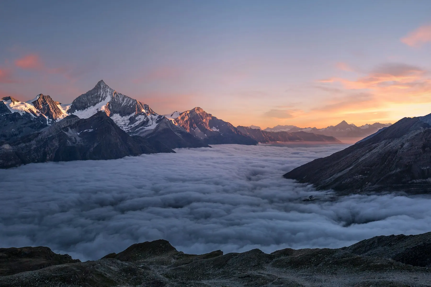
Default
Give it a ratio, width over height, and size the picture inside to fill it with size-full object-cover.
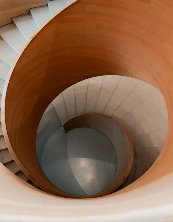
In a card
In a Card’s CardSection, the picture runs to the card’s edges and keeps its shape at any width the card takes, so a row of cards lines up.
Ratios
Any ratio, written as width over height. A box taller than the picture crops it with object-cover; use object-contain to show all of it.
Cover shape
Notes from the Dolomites · Draft
Changing
A new ratio glides on the layout role, and what sits below moves with it.
Installation
Copy code
npx shadcn@latest add https://kinoui.com/r/aspect-ratio.json- Files
lib/reduce-motion.tscomponents/kino/aspect-ratio.tsx- Packages
@base-ui/react- Global CSS
- the feels, the density tokens, the shape tokens and the success and warning colours
New to Kino? Installation covers what your project needs first and the @kino namespace.
API reference
Props
CSS variables
Accessibility
- The box itself has no role and isn’t read. Give the image inside an
altthat says what it shows, oralt=""when the text beside it already does. - With
render, it can be the link or figure itself, and that element keeps its own role and focus. - Under reduced motion, a new ratio takes its place at once.